Microsoft Excel Table Design Hacks
This will be the Part 3 of the Deadly Sins of Maintaining List in Excel which we have covered the first 2 part earlier.
Part 1 : Microsoft Excel : Deadly sins you should not do in Excel (Part 1)
Part 2: Microsoft Excel : Deadly sins of maintaining list in Excel sheet (Part 2)
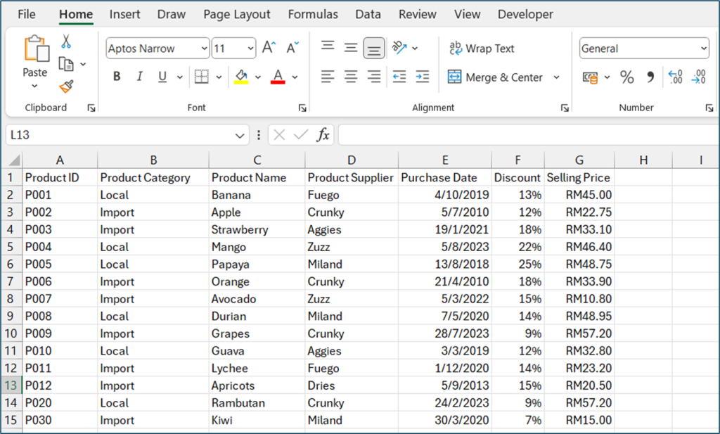
Each data belongs to its own column
While you’re designing a table or list in Excel, plan ahead is extremely important. Always remember, while you’re designing a table, plan and think of what you need, what kind of the report that you will need to create at the end month or the end of the year. From there, you will roughly know what sort of data you’re require to collect during data entry.
First, you must plan how many columns you need, name each column as what you need to collect in its column. Each column only limited to one types of data type.
If you have seen this kind of tabulated data and calling it a table. Well, you’re not quite right. This is a report, static report not a table or list.
Remember earlier we mention about each data should listed in its column only? Now take a look at the figure above, the month is not being listed in its column, same goes to the year and quarter. A table or a list should look as what shown in the figure below.

You know what’s worst? When the report extended from A column to BBR or whatsoever column and you need to scroll to the right just to scan through the data. So, here’s a thing, when I said the static report is doing you no good and troublesome, I do mean it. For example, one day later, you would like to analyse the data for Q1 throughout the year from 2010-2018, what would you do? Some people will choose to hide the columns that are not Q1, so they will be able to have a glance of the reports for only Q1. Well, that make some sense, right?
What about you changed your mind, now you would want to analyze that specific month July from the year 2010-2018? Remember earlier you have hid all the columns which are not Q1? And now in order to have a view of only July, you will first need to unhide all the hidden columns then hide again for columns which are not July.
Do you see the problems here? Hiding unhiding seems like an easy job, but the bigger issue is, you spend your time in Excel, busy hiding unhiding columns. For me, that’s a sign of unproductivity. Spending time doing repetitive stuff in Excel is definitely a waste of time.
Don’t even get me started on creating chart using that static report. The major difference of insert a chart using static report and pivot report is, pivot chart comes with the grouping capability while the normal does not. Below show 2 different charts, one insert using static report while another one is insert using Pivot Report.
Static Report to Static Chart
Pivot Report to Pivot Chart
Now you see the difference in between static report and Pivot Report?
Back to the topic about each data belongs to its own column. Never ever ever mix any data of different data and data type together in one column. “Especially the static report that I kept on mentioning, let Pivot Table handles it. All we have to do is plan the column and the data that needed to be collected”.
Besides no static report, you should be mixing data in one column. For example, there is an employee has resigned from the company. The HR would like to remark this in the Employee Table. So, what the HR did is replace the person’s salary from Salary column with a keyword “RESIGNED”. If you’re doing this, this is almost going to the end of the world! No joke, this is one of the worst thing you can ever do to a table.
Replacing the status with salary
Never ever mix data nor replacing current data with another item just like how the figure above shows. What I recommend you to do is adding in an extra column whether to name it as Remarks or Status and so you can record the status of each person in the company. Every data and column serve its own purpose and should be never replace by anything at all. Keeping the records is essential as it shows the history of employee. As your data started to get too crowded (too many rows), you can consider exporting them in the form of text file and file the data properly. You wouldn’t know you might need them someday later.
Add in extra column
You can also create a separate table containing all the data of resigned staff as what shown in the figure below. Plan ahead what work best for you and think about what you will be needing down the road for the next 5 to 10 years. What data is essential for you. Now you might not realize the impact, but later you will.
Solution for static report
*This solution is base on Excel 2016 Professional Plus
If you have ever heard of Power Query, that I my absolute favourite tool. Using Power Query, you can easily transform the static report back to table form and then use it to create Pivot Report.
- Convert the static report into a table. You may locate the Table command under Insert TabàTable
- Place your cursor in the table “Can be anywhere within the table, as long Excel can detect you’re selecting part of the table”. In the Data Tab, Select from Table of Range, Load the table into the Query.
- In the Transform Tab, locate the Transpose and transpose the whole table
- You will realize all the empty spaces below each group. Select Fill to fill down all the empty spaces
- You will not need the Grand Total column since you will be able to re-create it once you created your pivot report. Select the last column and remove it.
- The Products column are pivoted column. Select the all the product columns and unpivot
- Finally, select the load setting as your choice.